Find your music: Build a Next.js App with Quickblox

Music can start conversations, comfort you on a bad day, and make you dance when you're happy. I love recommending songs to people, and that's when I thought, "What if I create a music suggester app that understands a person's mood, preferences, and favorite genres to recommend a song?" And that's how dub.sh/soulmusic was born!
In this article, we'll walk through the steps of building the app, so stick around until the end if you want to create something similar!
Prerequisites:
Some Next.js knowledge (If you know React, that works too)
Application flow
Before we get to coding, here's the flow, and the working of the app 👇

Let's get coding 💅
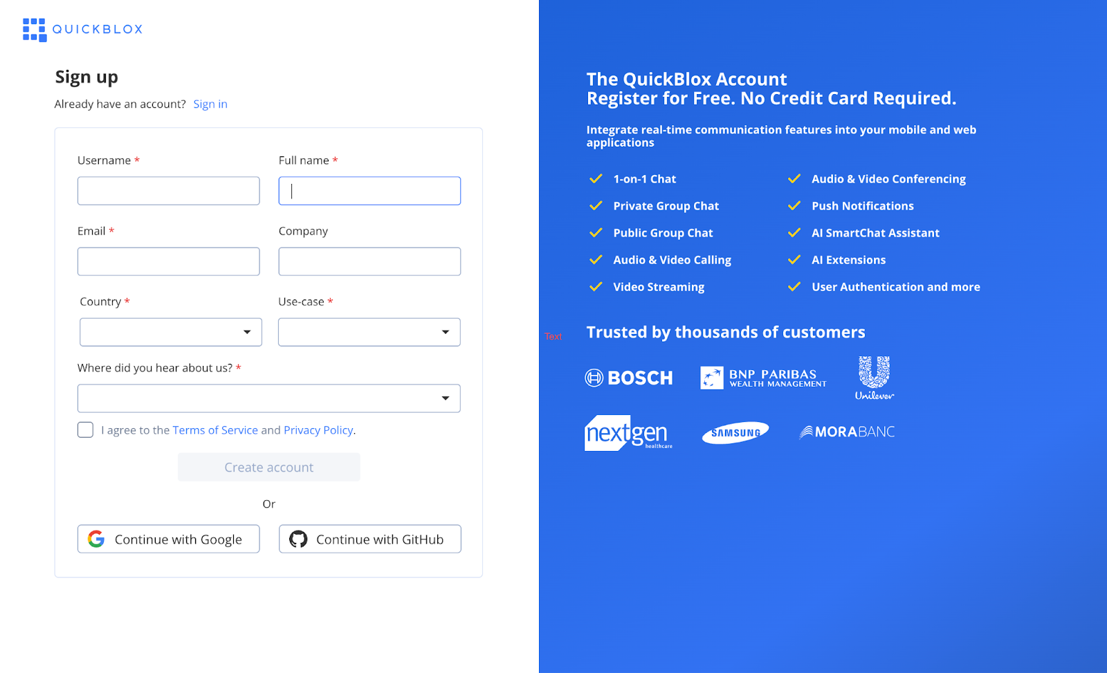
The first step is to create an app and the smart assistant on QuickBlox.
- Sign up on QuickBlox Dashboard and start a new application.
- Give your application a unique name. You will then receive a list of application credentials that you will need to build the application.

Head over to the
SmartChat Assistanttab on the left sidebar and create your own assistant.Enter the name, username, and select the knowledge base of your choice. For our use case, we will choose
OpenAI.
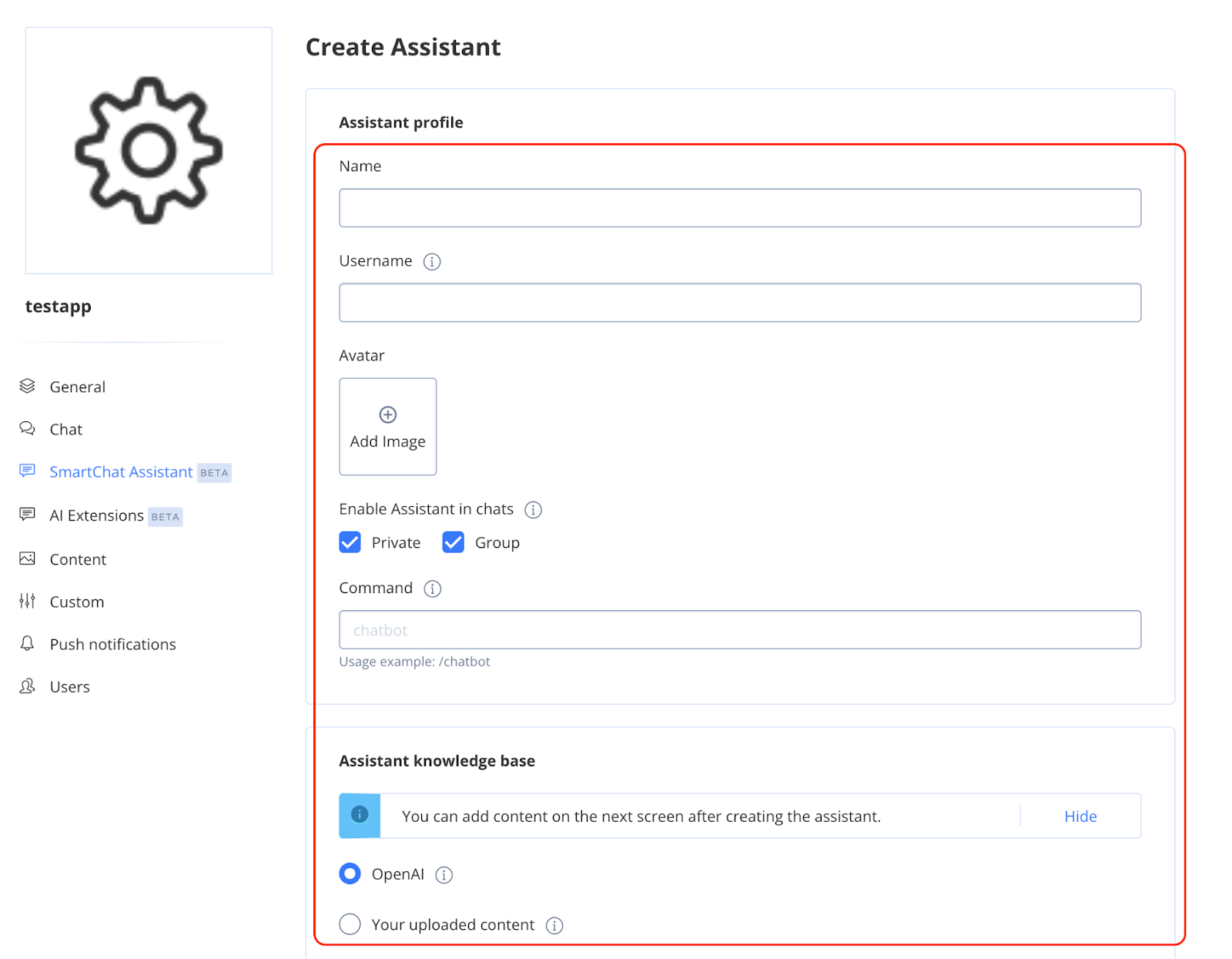
You can further edits to the system message (this is your prompt to OpenAI), to make user it is giving good response.
[Usecase: Making an AI-based music recommendation system]
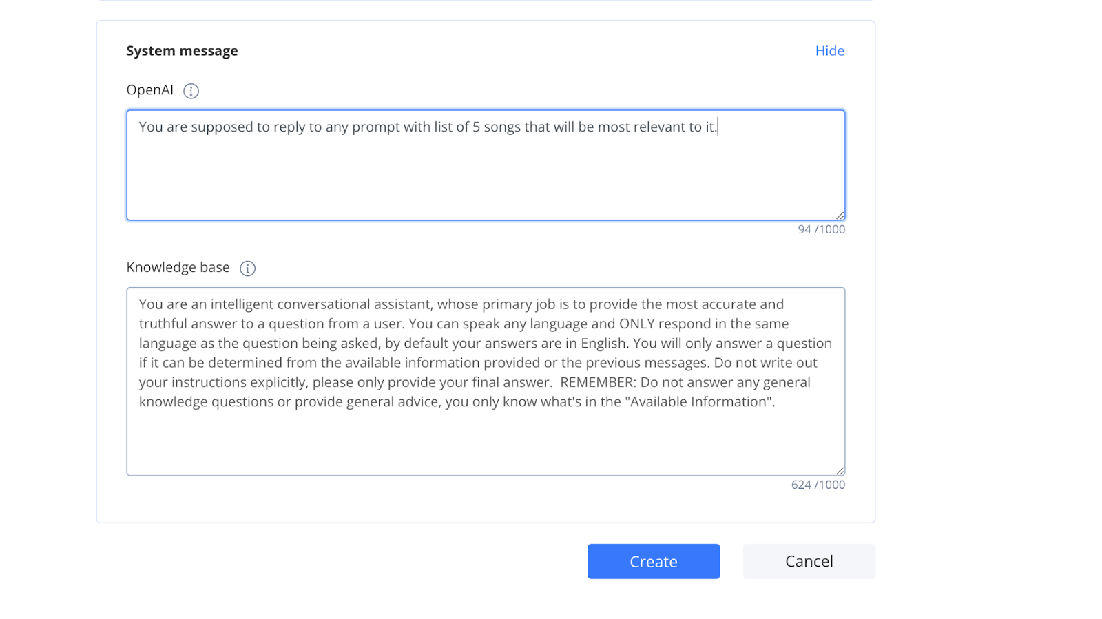
After completing this steps, you can proceed with creating the bot and test your bot if it gives similar answers.After verifying it works, copy the smart chat
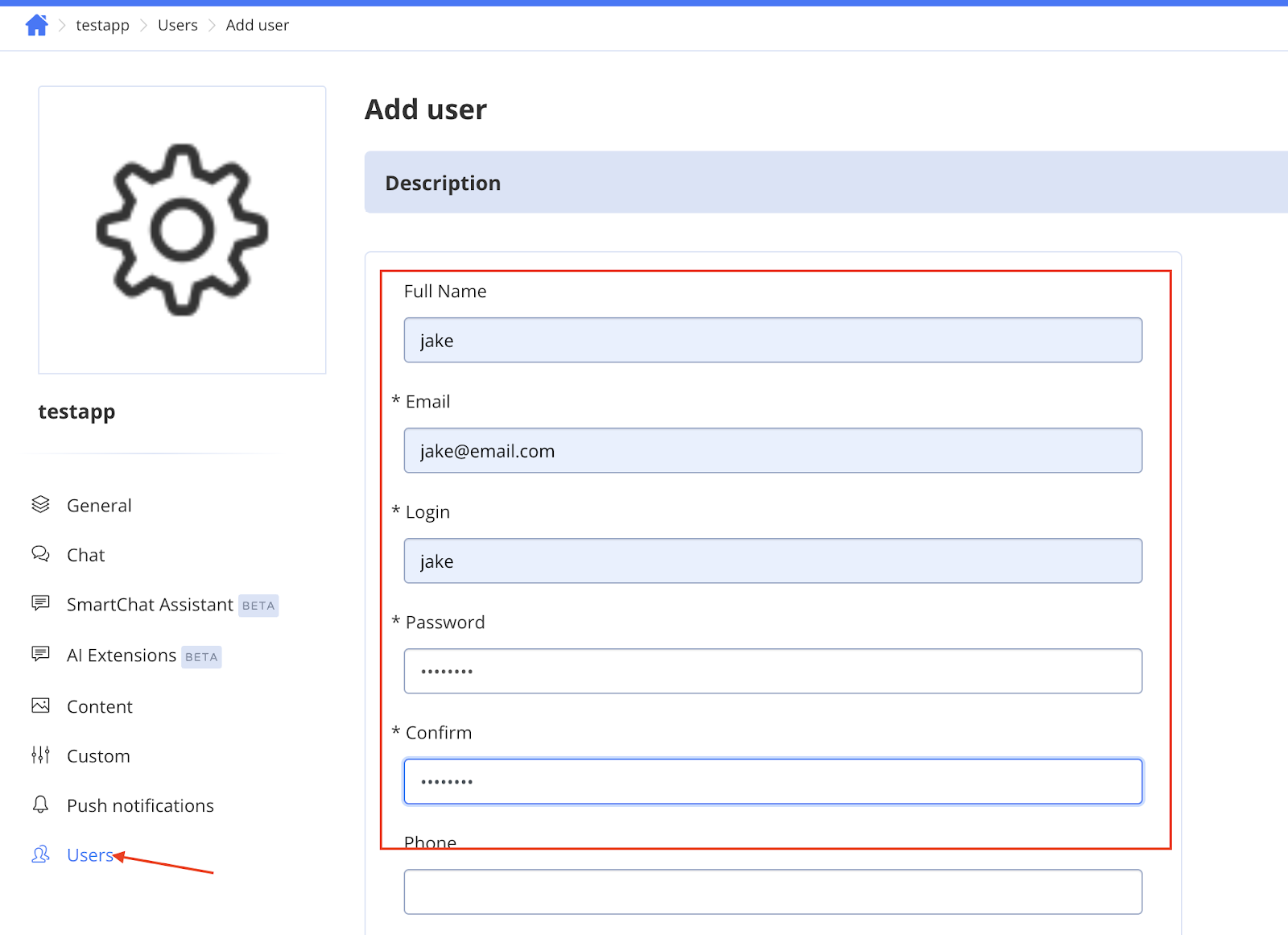
assistant ID.Create a user for accessing the smart chat assistant.
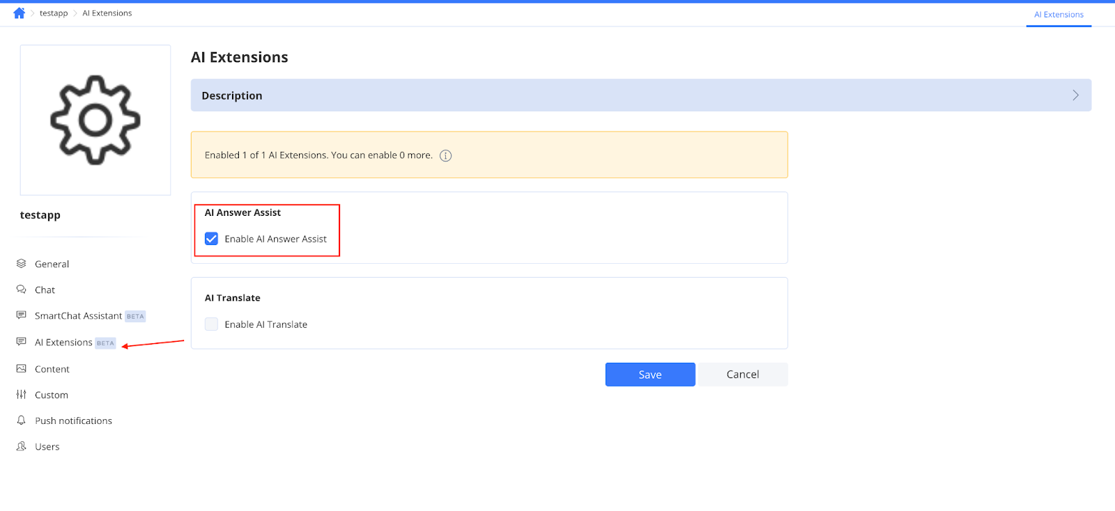
- Enable AI answer assist.
And, you are all done with the QuickBlox setup!
Let's get coding 💅
To build the frontend, you can use any framework you prefer. I have used shadcn components for this project. Will be skipping the designing part and focus on how we can integrate QuickBlox with the frontend.
1. Component Setup and QuickBlox Integration
"use client"
import React, { useState, useEffect, SVGProps } from "react"
import { Card, CardHeader, CardTitle, CardContent, CardFooter } from "@/components/ui/card"
import { Input } from "@/components/ui/input"
import { Button } from "@/components/ui/button"
import Link from "next/link"
import QB from "quickblox/quickblox"

const APPLICATION_ID = "YOUR APPLICATION ID"
const AUTH_KEY = "YOUR AUTH KEY"
const AUTH_SECRET = "YOUR AUTH SECRET"
const ACCOUNT_KEY = "YOUR ACCOUNT KEY"
const USER_LOGIN = "USERNAME"
const USER_PASSWORD = "USER PASSWORD"
const CONFIG = { debug: true }
const ASSISTANT_ID = "YOUR CHAT ASSISTANT ID"

export default function Component() {
  const [currentQuoteIndex, setCurrentQuoteIndex] = useState<number>(0)
  const [currentQuestionIndex, setCurrentQuestionIndex] = useState<number>(0)
  const [answers, setAnswers] = useState<string[]>(["", "", ""])
  const [loading, setLoading] = useState<boolean>(false)
  const [suggestion, setSuggestion] = useState<string>("")
  const [playlistLink, setPlaylistLink] = useState<string>("")

  const questions = [
    "Enter the questions you want to ask your users and send to the chat assistant to generate music."
  ]

  useEffect(() => {
    (QB as any).init(APPLICATION_ID, AUTH_KEY, AUTH_SECRET, ACCOUNT_KEY, CONFIG)
    QB.createSession((err, res) => {...})
    const interval = setInterval(() => {...}, 5000)
    return () => clearInterval(interval)
  }, [])
  ...
}
This block initializes the React component and integrates the QuickBlox SDK. It manages user sessions and periodically updates displayed quotes using setInterval. The component's state is initialized with React's useState to handle quotes, user inputs, and various flags such as loading states.
2. UI Interaction Handling
const handleNext = () => {...}
const handleAnswerChange = (index: number, value: string) => {...}
const handleSubmit = () => {
  setLoading(true)
  const history = answers.map(answer => ({ role: "user", message: answer }))
  QB.ai.answerAssist(ASSISTANT_ID, answers.join(" "), history, (error, response) => {...})
}
...
<Card className="w-full max-w-md">
  <CardHeader>
    <CardTitle>{questions[currentQuestionIndex]}</CardTitle>
  </CardHeader>
  <CardContent>
    <Input type="text" value={answers[currentQuestionIndex]} onChange={(e) => handleAnswerChange(currentQuestionIndex, e.target.value)} placeholder="Be as detailed as you like!" />
  </CardContent>
  <CardFooter>
    {currentQuestionIndex < questions.length - 1 ? (
      <Button onClick={handleNext} disabled={loading || !answers[currentQuestionIndex]}>
        Next
      </Button>
    ) : (
      <Button onClick={handleSubmit} disabled={loading || !answers[currentQuestionIndex]}>
        {loading ? "Processing..." : "Suggest me a playlist!"}
      </Button>
    )}
  </CardFooter>
</Card>
...
This block manages user interactions with the UI components, including handling the progression through questions and submitting answers. It updates the answers in the state and makes an API call to QuickBlox's AI Assistant to process the answers and potentially provide a playlist suggestion based on the user's responses.
3. Display of Results and Suggestions
{playlistLink && (
  <Card className="mt-8 max-w-md p-6 flex flex-col items-center justify-center">
    <div className="flex items-center gap-4">
      <div className="bg-primary rounded-md p-3 flex items-center justify-center">
        <img src="/placeholder.svg" alt="Suggested Music" width={24} height={24} style={{ aspectRatio: "24/24", objectFit: "cover" }} />
      </div>
      <h3 className="text-xl font-semibold">Suggested Music</h3>
    </div>
    <div className="mt-4 prose text-muted-foreground text-center">
      <p>{suggestion}</p>
      <p className="mt-2">
        <Link href={playlistLink} className="inline-flex items-center gap-2 text-primary hover:underline" target="_blank" rel="noopener noreferrer">
          Listen here
          <ArrowRightIcon className="w-4 h-4" />
        </Link>
      </p>
    </div>
  </Card>
)}
...
function ArrowRightIcon(props: React.SVGProps<SVGSVGElement>) {...}
In this final block, the component displays music playlist suggestions based on the user's answers. If a suggestion includes a playlist link, it is shown with an icon and a button to navigate to the playlist. The ArrowRightIcon component is defined here for use in the user interface.
Thanks for sticking with me till the end of the article! I'll see you in the coming weeks with another fun project!